Enhancing in-app training for OKX
Overview
Audited to seamlessly provide more relevant guidance and better educational content throughout the end-to-end experience in the OKX app.
Role
As content design lead, I identified this issue and drove the solution outside my regular workload, and subsequently got buy-in from leadership and stakeholders to resolve.
Problem
The OKX app had accumulated dozens of disconnected educational tooltips and modals over time — some outdated, others too technical, and many inconsistent in tone and structure.
Problem: Users were ignoring or dismissing tooltips, missing key product explanations.
Pain points:
Redundant or conflicting messaging
Inconsistent voice, tone, and hierarchy
Low engagement or click-through on educational CTAs
UX debt across flows due to uncoordinated growth

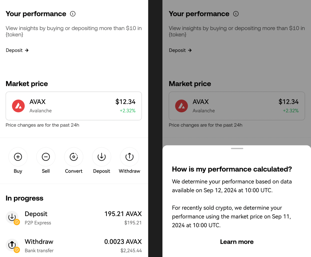
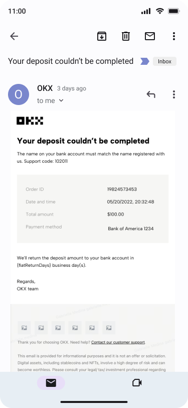
BEFORE
AFTER
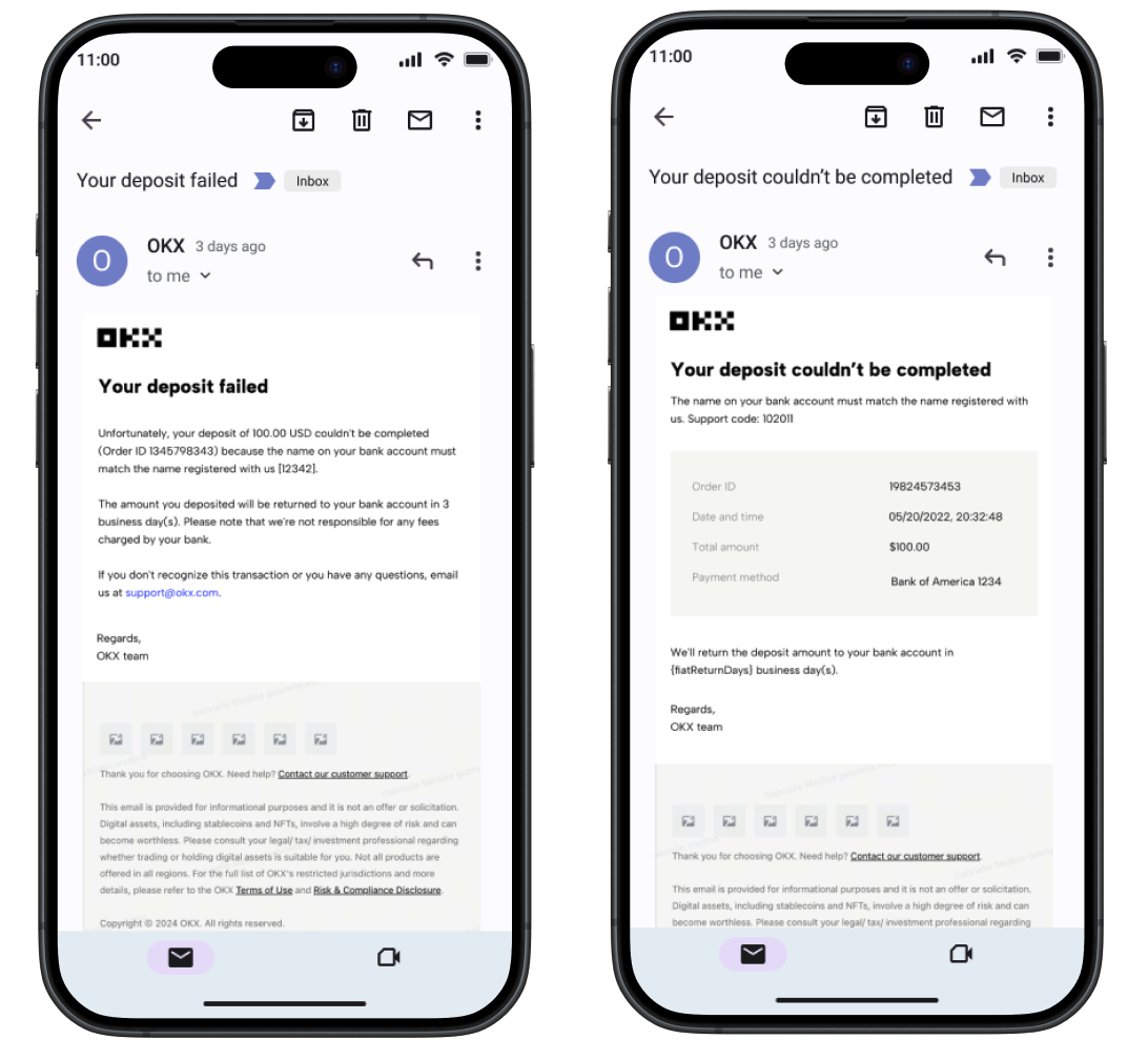
BEFORE (left) and AFTER (right)

BEFORE

AFTER
🔍 2. The Audit
I led a full audit of the product’s education surface area, which included:
🧾 Inventory of all tooltips and modals across mobile and web (100+ instances)
📊 UX evaluation: clarity, hierarchy, actionability
🧠 Content strategy review: audience, voice/tone alignment
🧱 Taxonomy breakdown: what kind of help (intro, tip, warning, guidance, CTA)?
Key findings:
Over 60% of modals were duplicative or poorly timed
Tooltips lacked clear formatting or consistent voice
Some content used outdated terms that no longer reflected OKX’s positioning
🧠 3. The Strategy
I developed a content and interaction framework to guide redesign:
Modals → For “What just happened?” or “What comes next?”
Tooltips → Quick-hit context, micro-coaching
Tone → Supportive, concise, never alarmist
Principles:
Lead with user need, not internal logic
Never say “simply” unless it actually is
Show, don’t just tell — visuals preferred when available
✍️ 4. The Execution
Working closely with Product Design and PMs, I:
Rewrote every tooltip/modal from the ground up
Introduced a modular content system with components for title/body/CTA patterns
Set up Figma-ready templates for scalable reuse
Integrated localization best practices for global rollout
Aligned with brand voice updates and regulatory UX compliance
📈 5. The Impact
✂️ Reduced total modals/tooltips by 40% (no loss of critical info)
📊 Increased tooltip engagement (users clicking “learn more”) by [X]%
🧭 Created a scalable UX education content framework for future features
🌍 Set the foundation for consistent localization across 15+ languages
Results
Users crave clarity—but timing is everything
Tooltips and modals should earn their place, not just explain complexity
Creating a system beats rewriting copy one-off: it scales, unifies, and empowers teams